WiiBrew:Contests/General homebrew logo: Difference between revisions
Jump to navigation
Jump to search
| Line 19: | Line 19: | ||
* [[Image:wiibrew_kaktus621.jpg]] | * [[Image:wiibrew_kaktus621.jpg]] | ||
* [[Image:Wiibrew_Kaktus621_2.jpg]] | * [[Image:Wiibrew_Kaktus621_2.jpg]] | ||
* [[Image: | * [[Image:WB_smaller.png]] | ||
A more Logo-like Image, can be Scaled down for Icons or something like this (Vector Graphics) | A more Logo-like Image, can be Scaled down for Icons or something like this (Vector Graphics) | ||
Revision as of 18:58, 21 March 2008
Contest: General Homebrew
 <segher> the logo should at first glance refer to our homebrew stuff, not just to the game
 <MadCatMk2> Just a quick recommendation: I think the logo should be rather simplistic, so as smaller versions are easily recognisable.
This contest is open
A lot of the less-specific entries into the Zelda Chainloader contest would be good candidates for the General Homebrew logo.
amoose136
With blurry reflections.
CyberAxe
dasda
Kaktus621
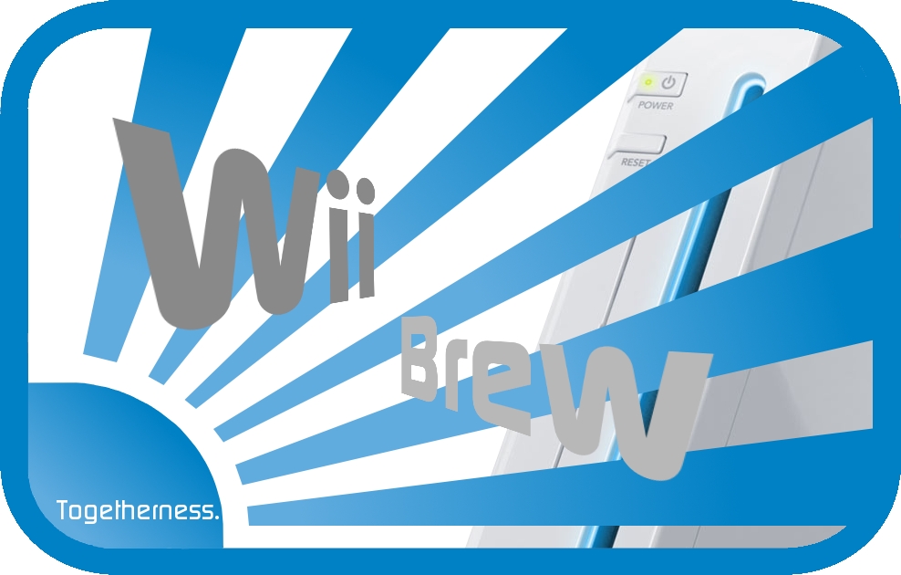
A more Logo-like Image, can be Scaled down for Icons or something like this (Vector Graphics)
limnique
MadMUHHH
olster2

- standard

- has the wii in the background (i realize you can see a faint witness on the edges of the blue sun but shhhhhhhhh!)
- Has a nice border round the edges
- Same as above but with transparent background


